You are here: Foswiki>Development Web>ReleaseProcess>FeatureRequest>ShipSubscribePluginWithFoswiki01x01 (05 Jul 2015, GeorgeClark)Edit Attach
Feature Proposal: Ship the SubscribePlugin with Foswiki 1.2
Motivation
- Easy, non-geeky interface over manually editting the WebNotify page
- Low hanging fruit to make Foswiki more usable
- KISS
Description and Documentation
For Foswiki 1.2, ship and enable by default the SubscribePluginExamples
Impact
Implementation
This is how it will look it both the subscribed and unsubscribed states:s.
Will also update FamFamFamContrib to show the subscribe icon.
-- Contributors: WillNorris, AndrewJones - 19 Apr 2011
Discussion
Great idea! Maybe it can be done using icons showing the subscription status (like in Confluence, see "watch" icon in the upper right corner of this screenshot). -- FranzJosefGigler - 17 Apr 2009
In what way can you manage all of your subscribed pages? Note that the display bug caused by the addtition of the button in the foswiki site skin has not been solved yet. -- ArthurClemens - 09 May 2009 This obviously didn't make it in 1.1. Can it be included with 1.2? Will, I don't mind doing the work if you don't have the time. -- AndrewJones - 18 Apr 2011 sure, i don't mind if anyone works on this. but the task seems to be to drive a design and consensus before any code changes are implemented. -- WillNorris - 18 Apr 2011 OK, I have updated the proposal with a proposed design. Will restart the clock so we can have a discussion. -- AndrewJones - 19 Apr 2011 1+ to make it part of the default distribution. FamFamFamContrib is already part of the default distribution and comes with a toolbar (Topic_action_icons) that can optionally be enabled. It then should also carry the related subscribe button. -- IngoKappler - 20 Apr 2011 Yeah good idea. I will also update the FamFamFamContrib template as part of this proposal. -- AndrewJones - 20 Apr 2011 Updated the patch to show the changes to FamFamFamContrib and to use the
s access key.
AcceptedBy14DayRule?
-- AndrewJones - 03 May 2011
I would say that the principle of adding the plugin in 1.2 does not seems to have been argued against.
But I still fail to see the solution to the UI problem that Arthur raised.
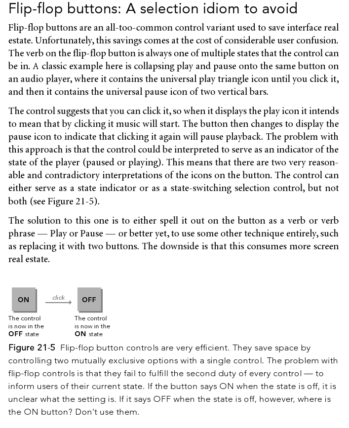
I am equally concerned that we get a confused toggle. The subscribe feature is a toggle. By default you are not subscribed. Once you have clicked the button you are. How is this displayed? With an unsubscribe button? Is this obvious? - It is using a toggle icon, as the plugin does by default. See the attached image to see how it will look in both states. So it is using a "flip-flop" button. It seems obvious to me, but if anyone has a better idea then I would be happy to consider it. -- AndrewJones - 04 May 2011
- Yes, this is how the plugin currently works. If you are subscribed to all topics in a web, you are shown unsubscribe buttons. If you click unsubscribe on a topic, you will unsubscribe from that topic only. You will still be subscribed for all the other topics in a web (i.e. if you unsubscribe from WebHome, you end up with this in WebNotify:
Main.AndrewJones: * - WebHome) -- AndrewJones - 04 May 2011
- Yes, it works both with the FamFamFamContrib icons, and without. I will update both. The attached image shows how it looks with plain PatternSkin -- AndrewJones - 04 May 2011
- I'm not sure where documentation would be. Presumably something in the release notes will be enough? If an admin does not want it, they can simply disable the plugin and the buttons will disappear. -- AndrewJones - 04 May 2011
- Tasks subscriptions take forever. It was adding 5-7 seconds to view. It's actually an issue in the MailerContrib subscription handling.
- Tasks can't be manually subscribed anyway.
- No way to exclude webs. It's all or nothing.
ChangeProposalForm edit
| TopicSummary | Ship the SubscribePlugin with Foswiki 1.2 |
| CurrentState | MergedToCore |
| CommittedDeveloper | AndrewJones |
| ReasonForDecision | ConsensusReached |
| DateOfCommitment | 19 Apr 2011 |
| ConcernRaisedBy | |
| BugTracking | Tasks.Item10830 |
| RelatedTopics | |
| PlannedFor | 2.0 |
| I | Attachment | Action | Size | Date | Who | Comment |
|---|---|---|---|---|---|---|
| |
SubscribePlugin.JPG | manage | 13 K | 04 May 2011 - 09:58 | AndrewJones | Showing the states |
| |
flip-flop-buttons.png | manage | 154 K | 20 Apr 2009 - 05:27 | WillNorris | |
| |
subscribe_diff.txt | manage | 7 K | 03 May 2011 - 11:18 | AndrewJones |
Edit | Attach | Print version | History: r25 < r24 < r23 < r22 | Backlinks | View wiki text | Edit wiki text | More topic actions
Topic revision: r25 - 05 Jul 2015, GeorgeClark
The copyright of the content on this website is held by the contributing authors, except where stated elsewhere. See Copyright Statement.  Legal Imprint Privacy Policy
 Legal Imprint Privacy Policy

