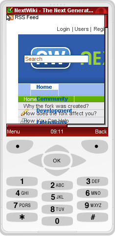
nextwiki.org is not readable in opera mini.
will be nice to get mobile version to read news about the next wiki to go.
www.nextwiki.org looks okay on the iPhone though. Just some font issues like with Google Chrome. -- MartinSeibert - 12 Nov 2008 - 19:32
No, I think it will be a probem with CSS. Search input field, upper and right navigation overlayed left. -- MichaelGustavSimon - 13 Nov 2008 - 07:33
Please provide screenshots as possible. -- MichaelDaum - 13 Nov 2008 - 07:46
Screenshot nextwiki.org in opera mini. Play around opera mini yourself @ http://www.operamini.com/demo/. -- MichaelGustavSimon - 13 Nov 2008 - 08:09
Ah okay. That needs a completely different approach to fit it in there. -- MichaelDaum - 13 Nov 2008 - 08:49 It looks a lot better now, but still serious issues with the main navigation that does not wrap. See also Item192. -- ArthurClemens - 07 Feb 2009 closing this because the preview at http://www.operamini.com/demo/ looks reasonable and also because any additional outstanding changes should be addressed via Item192. -- WillNorris - 10 Apr 2009
www.nextwiki.org looks okay on the iPhone though. Just some font issues like with Google Chrome. -- MartinSeibert - 12 Nov 2008 - 19:32
No, I think it will be a probem with CSS. Search input field, upper and right navigation overlayed left. -- MichaelGustavSimon - 13 Nov 2008 - 07:33
Please provide screenshots as possible. -- MichaelDaum - 13 Nov 2008 - 07:46
Screenshot nextwiki.org in opera mini. Play around opera mini yourself @ http://www.operamini.com/demo/.
 -- MichaelGustavSimon - 13 Nov 2008 - 08:09
Ah okay. That needs a completely different approach to fit it in there. -- MichaelDaum - 13 Nov 2008 - 08:49 It looks a lot better now, but still serious issues with the main navigation that does not wrap. See also Item192. -- ArthurClemens - 07 Feb 2009 closing this because the preview at http://www.operamini.com/demo/ looks reasonable and also because any additional outstanding changes should be addressed via Item192. -- WillNorris - 10 Apr 2009
ItemTemplate edit
| Summary | The website does not render well on Opera Mini |
| ReportedBy | MichaelGustavSimon |
| Codebase | |
| SVN Range | TWiki-4.2.3, Wed, 06 Aug 2008, build 17396 |
| AppliesTo | Extension |
| Component | FoswikiSiteSkin |
| Priority | Enhancement |
| CurrentState | Closed |
| WaitingFor | |
| Checkins | |
| ReleasedIn |
| I | Attachment | Action | Size | Date | Who | Comment |
|---|---|---|---|---|---|---|
| |
nextwiki.png | manage | 29 K | 13 Nov 2008 - 08:09 | MichaelGustavSimon |
Edit | Attach | Print version | History: r9 < r8 < r7 < r6 | Backlinks | View wiki text | Edit wiki text | More topic actions
Topic revision: r9 - 10 Apr 2009, WillNorris
The copyright of the content on this website is held by the contributing authors, except where stated elsewhere. See Copyright Statement.  Legal Imprint Privacy Policy
 Legal Imprint Privacy Policy

