You are here: Foswiki>Development Web>ReleaseProcess>FeatureRequest>RedesignManagingWebs (18 Feb 2010, MichaelDaum)Edit Attach
Feature Proposal: Redesign ManagingWebs
Motivation
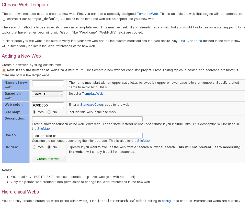
Let me call System.ManagingWebs a usability nightmare. Made it urgent because I can't stand this any longer. See also Tasks.Item310. The below form shall be implemented on WebCreateNewWeb. We could also think about making it a template the same way WebCreateNewTopicTemplate is implemented. The form gets completely removed from ManagingWebs that will remain a pure help topic. In addition I'd like to deprecated the variables SITEMAPWHAT and SITEMAPUSEDTO. They never got used in a consistent way and people are constantly irritated having to write two descriptions for one web. Instead, this should be something like WEBDESCRIPTION. WEBCOLORS, do we really need this? If so then we need to ship a decent color picker similar to the date picker we have. Asking for a plain HEX value is bad.- Since random colors don't look good, a given skin should probably have a set of compatible colors selected by someone with an artistic eye. -- BobBagwill - 10 Dec 2008 - 12:37
Before

After
Create a new Web
Description and Documentation
Managing webs needs a redesignExamples
Impact
Implementation
-- Contributors: MichaelDaum - 26 Nov 2008Discussion
In templating or the corresponding core routines? -- OliverKrueger - 29 Nov 2008 Ideas how? -- ArthurClemens - 30 Nov 2008 - 16:39 A option: define other variables when creating new web, like PreferencesPlugin -- CarlinhosCecconi - 01 Dec 2008 - 11:53SHORTDESCRIPTION is used consistently in plugins and contribs. Might be an idea to use that instead of WEBDESCRIPTION.
-- CrawfordCurrie - 01 Dec 2008 - 13:42
Hm SHORTDESCRIPTION is set on a plugin topic. That would override the web description actually...
-- MichaelDaum - 01 Dec 2008 - 14:23
How does hiding the user interface improve usability?
How will people find out that clicking what looks like a link it actually a twisty that reveals more fields?
Why would people choose not to click on it?
The expanded form is so simple with so few fields that it makes no sense to hide it. On the contrary it makes it more dificult. I could understand if it added 10-20 new highly expert settings. But that is not the case.
I like the improved form compared to the old, but without the twisty which does not even look like a twisty.
I have seen enough of my users not knowing that they can see attachments by clicking the Attachment twisty to know that the twisty idea only works when it is a very integrated part of a UI design. Such a single link-looking interface is overlooked.
-- KennethLavrsen - 01 Dec 2008 - 17:05
Hiding part of the userinterface does in fact improve usability because it simplifies it. Showing more stuff than needed builds up a cognitive burden that you'd better avoid. The current form creates a minimal interface to get the job done. More advanced use cases are available by clicking on "Show advanced options". A pretty common meme in userinterfaces that people already know from elsewhere.
However, I agree that the extra arrow icon might be missing for people to make it more obvious that there is a twisty.
-- MichaelDaum - 01 Dec 2008 - 20:48
Added toggle icons to address Kenneth's concerns.
-- MichaelDaum - 02 Dec 2008 - 08:54
The problem is that users won't know what is behind "advanced options". So this should be made more visible: "More opions (web template, appearance in sitemap)". But this would go against simplifying.
Alternatively, show the default settings for web template and sitemap, with twisties to make a change. For instance:
Additional settings
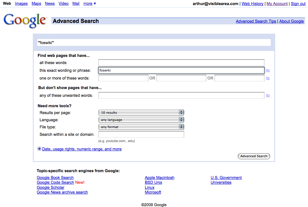
-- ArthurClemens - 02 Dec 2008 - 13:06 A typical User creating webs will have some experience using the foswiki - at least he has a basic grasp of the meaning of "web". For example, it should be simple enough for him to change the color later on. Idea: The first page opened after creation of a new web (using a new simplified interface) should be its preferences page - there the user can configure the parameters of the new web to his liking and level of understanding. This means that the Preferences page should be as explanatory as possible and painless to go through, even for a rather new user of foswiki. -- YogiParish - 06 Dec 2008 - 10:34 Lost patience and trust in this process. -- MichaelDaum - 09 Dec 2008 - 15:16 I like that proposal. I would not get ride of the web color though as I'm sure some people are still using it with pattern skin for instance. JQuery color picker à la Drupal would be most welcome of course. -- StephaneLenclud - 10 Dec 2008 - 10:47 Reacting on Michael Daum: how should the process look like? -- ArthurClemens - 10 Dec 2008 - 16:50 I can't believe that having it as a twisty or not is stopping this proposal. It improves the task of creating a new web for at least 90% of times you want add a web. The 10% (or probably less) where you need more than the what is not directly visible, you'll catch that link as you're in a "looking for more options" mode... -- Carlo I am not totally against a twisty, but I have a concern about the wording "Advanced options" that does not reveal the contents. -- ArthurClemens - 11 Dec 2008 - 09:31 The proposed interface does not work out anymore with the latest site changes on foswiki. -- MichaelDaum - 08 Jan 2009 See the recent update of Google advanced search, with the explicit label of the twisty: I have updated the twisty label of the proposed interface above.
-- ArthurClemens - 30 Apr 2009
A couple of wikis have now been deployed coming with the original proposal while the original ManagingWebs topic was reverted to a docu-only topic. I asked a number of users what they think about it, i.e. if they where aware of the more options hidden inside the twisty. Reactions where all positive about it: it is clearly arranged and a lot less cluttered. Nobody complained that "More options" did in a way obscure the features hidden away at first glance. Au contrair: most clicked on the "More options" twisty right away just out of curiosity. Therefore I can't see the critiques by Kenneth justified that hiding some less commonly used features in a twisty is in any way bad.
I am not sure if the more verbose "Web template, appearance in sitemap, global search" cuts it. Franky, I don't know what a link of that name should do. It might also be counter-productive as it complicates the interface a bit more than needed.
-- MichaelDaum - 03 May 2009
I cannot answer that without user testing. I suspect that Google has done extensive testing on that screen though, and obviously it does not hurt.
-- ArthurClemens - 03 May 2009
bah! where's my
 WEBBGCOLOR ? :/
-- WillNorris - 09 May 2009
... and what about WEBTOPICLIST :-Q
-- MichaelDaum - 09 May 2009
I like the new form. Why has this not been incorporated in the new wiki? Is it due to a minor difference over the Twisty plugin part?
-- GuruprasadIyer - 31 Aug 2009
Yes. Actually, the proposed form needs more tweaking as users have difficulties to create new subwebs and name them accordingly.
-- MichaelDaum - 31 Aug 2009
BTW SHORTDESCRIPTION is not set in a plugin topic (unless you happen to be visiting that topic). PluginName_SHORTDESCRIPTION is, however, set. Bloody shorthand preferences in plugin topics ExistingWeb.NewWeb has proven to be errorprone. I propose the addition of a dropdown list (like the one that is used for the template web) to choose the parent web from. To make life easier, that list could be toggled with the state of the variable {EnableHierarchicalWebs}, so that it's only usable when allowed.
-- JoachimBlum - 02 Sep 2009
I totally agree. It will require some backend connections to be made.
-- ArthurClemens - 02 Sep 2009
ChangeProposalForm edit
| I | Attachment | Action | Size | Date | Who | Comment |
|---|---|---|---|---|---|---|
| |
Google_Advanced_Search-live_update-20090501.png | manage | 75 K | 30 Apr 2009 - 22:30 | ArthurClemens | Example of Google advanced search |
| |
ManagingWebsSnap1.png | manage | 100 K | 01 Dec 2008 - 11:28 | MichaelDaum |
Edit | Attach | Print version | History: r36 < r35 < r34 < r33 | Backlinks | View wiki text | Edit wiki text | More topic actions
Topic revision: r36 - 18 Feb 2010, MichaelDaum
The copyright of the content on this website is held by the contributing authors, except where stated elsewhere. See Copyright Statement.  Legal Imprint Privacy Policy
 Legal Imprint Privacy Policy

