You are here: Foswiki>Development Web>BrainStorming>RethinkingTopicInteraction>WireframesEditScreen>WireframesEditScreenInspirations (13 Apr 2010, ArthurClemens)Edit Attach

Wireframes Edit Screen Inspirations
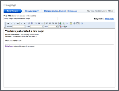
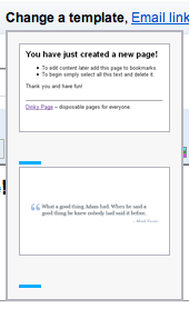
Collection of links and screenshots informing the mock ups discussed at WireframesEditScreen While not top notch, still a couple of useful things to borrow from http://www.dinkypage.com/ The switch to choose the editor, top right, is much easier to find (and understand) than the small cryptic buttons in our menu bar. When clicking "Change a template" you get a visual representation, which speaks for itself. -- ArthurClemens - 21 Dec 2009 The "Save Changes" arrow looks like a workflow position indicator.- I think that is the intention - after creating and saving, you will view (and share) the page. -- ArthurClemens - 22 Dec 2009
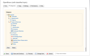
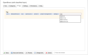
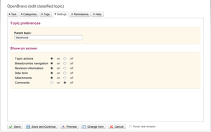
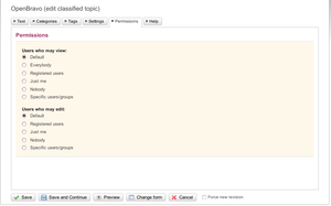 -- MichaelDaum - 23 Dec 2009
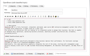
Here's a screenshot from EditMe's latest release: they added a checkbox to the title "update page address based on title". So when the user enters the edit screen and changes the topic title, it optionally also alters the WikiName of the page.
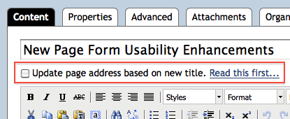 -- MichaelDaum - 25 Dec 2009
@Micheal: Could you please provide some example screenshot of the tabbed / sectioned forms you were talking about?
-- CarloSchulz - 06 Jan 2010
@Carlo, here are some:
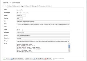
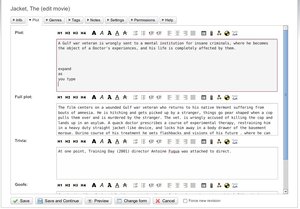
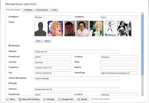
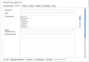
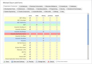
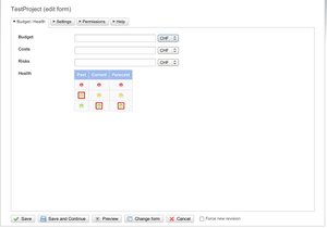
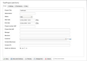
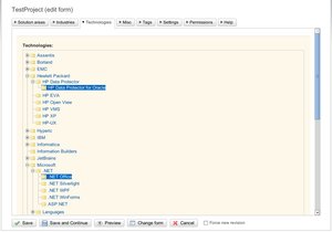 -- MichaelDaum - 07 Jan 2010
Ok, I see the problems...
Now, I need to think about a solution
 BasicForm edit
| TopicClassification | Select one... |
| TopicSummary | |
| InterestedParties |
| I | Attachment | Action | Size | Date | Who | Comment |
|---|---|---|---|---|---|---|
| |
NatEditSnap1.png | manage | 77 K | 23 Dec 2009 - 09:36 | MichaelDaum | |
| |
NatEditSnap10.jpeg | manage | 100 K | 07 Jan 2010 - 09:12 | MichaelDaum | |
| |
NatEditSnap11.jpeg | manage | 43 K | 07 Jan 2010 - 09:18 | MichaelDaum | |
| |
NatEditSnap12.jpeg | manage | 65 K | 07 Jan 2010 - 09:18 | MichaelDaum | |
| |
NatEditSnap13.jpeg | manage | 67 K | 07 Jan 2010 - 09:18 | MichaelDaum | |
| |
NatEditSnap2.png | manage | 53 K | 23 Dec 2009 - 09:37 | MichaelDaum | |
| |
NatEditSnap3.png | manage | 30 K | 23 Dec 2009 - 09:37 | MichaelDaum | |
| |
NatEditSnap4.png | manage | 42 K | 23 Dec 2009 - 09:38 | MichaelDaum | |
| |
NatEditSnap5.png | manage | 43 K | 23 Dec 2009 - 09:38 | MichaelDaum | |
| |
NatEditSnap6.jpeg | manage | 87 K | 07 Jan 2010 - 09:10 | MichaelDaum | |
| |
NatEditSnap7.jpeg | manage | 114 K | 07 Jan 2010 - 09:11 | MichaelDaum | |
| |
NatEditSnap8.jpeg | manage | 91 K | 07 Jan 2010 - 09:12 | MichaelDaum | |
| |
NatEditSnap9.jpeg | manage | 57 K | 07 Jan 2010 - 09:12 | MichaelDaum | |
| |
dinkypage.com-templates.png | manage | 19 K | 21 Dec 2009 - 19:47 | ArthurClemens | |
| |
dinkypage.com.png | manage | 55 K | 21 Dec 2009 - 19:44 | ArthurClemens | |
| |
wikihow.png | manage | 232 K | 13 Apr 2010 - 18:42 | ArthurClemens |
Edit | Attach | Print version | History: r2 < r1 | Backlinks | View wiki text | Edit wiki text | More topic actions
Topic revision: r2 - 13 Apr 2010, ArthurClemens
The copyright of the content on this website is held by the contributing authors, except where stated elsewhere. See Copyright Statement.  Legal Imprint Privacy Policy
 Legal Imprint Privacy Policy
