You are here: Foswiki>Development Web>BrainStorming>RethinkingTopicInteraction>WireframesEditScreen (12 Mar 2014, MichaelDaum)Edit Attach
Wireframes for the Edit screen
UPDATE: I moved the examples from other editors to WireframesEditScreenInspirations to allow a better overview of the mock ups we have for foswiki already... -- CarloSchulz - 09 Jan 2010
Thinks which need to be addressed
TopicTitle
I am sceptical of the EditMe (see WireframesEditScreenInspirations) approach which adds yet another checkbox; I would rather:- Assume that TopicTitle becomes a core feature and all skins are required to implement a field above the topic content editor as in NatEdit.
- Adjust the default new topic template so that it had a
%TOPICTITLE%in a heading1 at the top. - Recognising that most legacy wikis with lots of legacy content will only gradually gain new TopicTitle data:
- If there is no
%TOPICTITLE%macro present in the topic text- If the first line of text in the topic is a heading, offer to copy that to the TopicTitle field and replace it with the
%TOPICTITLE%macro. - If the user modifies the TopicTitle then automatically insert a
%TOPICTITLE%into a heading1 at the top of the topic in the editor content.
- If the first line of text in the topic is a heading, offer to copy that to the TopicTitle field and replace it with the
- If there is no
- If there is a
%TOPICTITLE%macro present somewhere in the editor content, then deleting the contents of the TopicTitle field should automatically populate it with the name of the topic.- Because if TopicTitle is blank, the topic name is what
%TOPICTITLE%should expand out as anyway.
- Because if TopicTitle is blank, the topic name is what
- Renaming a topic should keep the TopicTitle in sync, if:
-
%TOPICTITLE%=%TOPIC%, OR -
%TOPICTITLE%=%SPACEOUT{"%TOPIC%"}%
-
Macros and WYSIWYG
Working on WysiwygEditorAndMacros provided us with a way of rendering%TOPICTITLE% as an interactive object in the editor that would normally take the value of TopicTitle, instead of a confusing naked macro name...
Form fields
As much as I like NatEdit I also agree that it's much more usable to have the form above or below the topic editor, instead of on a separate tab. But then it would be great to have forms which could be instantly editable from view without having to click edit, which might be a better approach (I am thinking about new attributes - other than the existing H and M used in data form definition tables - for enabling wysiwyg on formfields).- Of course. "Edit form" is one of the shortcuts of the edit menu. I think it should only show a page with the form. -- AC
- With the Form vs Topic editing in tabs or not, I can see how the separate tab would be useful.
Perhaps it would be nice if I could choose that the form tab opened up by default, instead ofEDITACTION=formwhich hides the topic editor tab completely. - I also like Carlo's mockup, but it would be very useful to app developers to choose that the Meta Data section goes above the topic editor, or perhaps a better idea is that there is some way to hide the editor by default inside a twisty.
- Perhaps we can also talk about the WYSIWYG fullscreen issue, Tasks.Item2285. Users are a little disoriented at first because they don't realise you have to escape from fullscreen mode before you can save or exit. Especially for users that hit fullscreen by accident.
Main.SvenDowideit raised a good issue also, and that is why should we bother "Save Changes" vs "Save and Continue" - Just have one "Save" button and one "Exit" button, like a normal native rich client application. The "Exit" button would ask if you want to discard the changes.
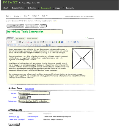
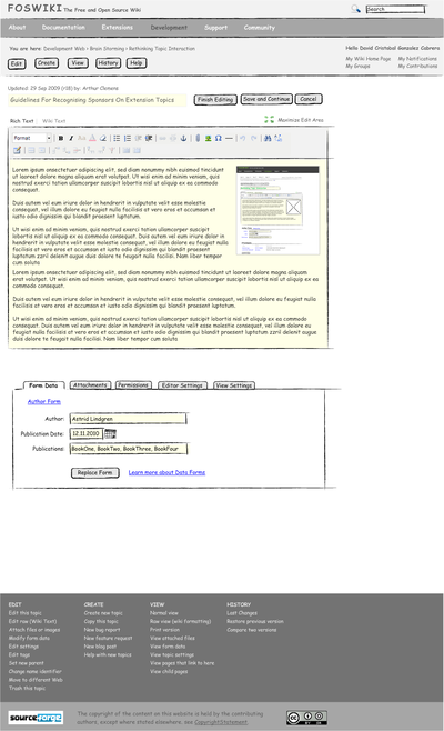
First round of mock ups
Some sketches showing the edit screen: -- Carlo If we create a long edit page with sections, those should be visible/accessible though a TOC or side menu. Perhaps fold them with twisties (with a 'remember' setting).- Good idea. Another one might be to use a tabbed section. -- CS
- Tabs is what I did not like from NatEdit when it was installed on foswiki.org. It is too easy to miss a section. For example for bug reporting the form is almost the most important. -- AC
-
 this way we could get rid of an extra screen. -- CS
- Of course. This was just a quick draft -- CarloSchulz - 04 Jan 2010
Discussion
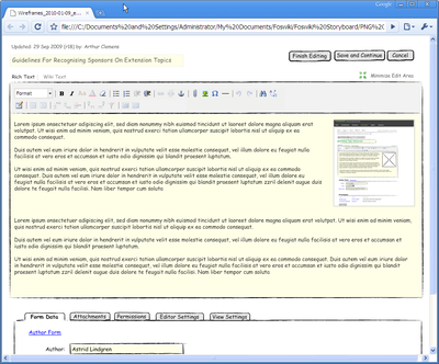
Is this different to the editor full-screen mode, where there's only the TinyMCE editor taking up the full browser window? -- PaulHarvey - 10 Jan 2010 Yes, in full screen edit mode with TinyMCE theres is no space around the editor and no other controls outside the toolbar. -- CarloSchulz - 10 Jan 2010 There could be an in-place editing version, where you can edit the topic or part of it. I assume that would only show the editor, not the tabs. But fullscreen mode would be handy because the working area could be limited due to side bars. -- ArthurClemens - 10 Jan 2010UserExperienceProjectForm edit
| TopicTitle | Wireframes for the Edit screen |
| TopicSummary | Wireframes for edit screen of new release skin |
| Subject | skin |
| Status | abandoned |
| Status note | no activity |
| Driver | |
| Skills needed | interaction design, visual design, frontend programming, perl programming |
| InterestedParties | WysiwygTaskTeam |
| I | Attachment | Action | Size | Date | Who | Comment |
|---|---|---|---|---|---|---|
| |
Wireframes_2010-01-03_Edit_screen.png | manage | 125 K | 03 Jan 2010 - 17:25 | CarloSchulz | |
| |
Wireframes_2010-01-04_Edit_screen.png | manage | 140 K | 04 Jan 2010 - 13:40 | CarloSchulz | |
| |
Wireframes_2010-01-06_edit_screen.png | manage | 206 K | 06 Jan 2010 - 20:45 | CarloSchulz | |
| |
Wireframes_2010-01-09_edit_fullsize_w.Browser.png | manage | 191 K | 09 Jan 2010 - 16:00 | CarloSchulz |
Edit | Attach | Print version | History: r25 < r24 < r23 < r22 | Backlinks | View wiki text | Edit wiki text | More topic actions
Topic revision: r25 - 12 Mar 2014, MichaelDaum
The copyright of the content on this website is held by the contributing authors, except where stated elsewhere. See Copyright Statement.  Legal Imprint Privacy Policy
 Legal Imprint Privacy Policy


