You are here: Foswiki>Development Web>BrainStorming>RethinkingTopicInteraction>WireframesViewScreen (12 Mar 2014, MichaelDaum)Edit Attach
WireframesViewScreen
Update: I've refactored this topic to be more of a specification document with screenshots of the latest mock ups and accompanying documentation of planned features. It now contains the latest mock ups only. The design studies and the discussions related to the visual design have been moved to DesignStudiesForNewSkin. -- CarloSchulz - 10 Jan 2010Table of contents:
Overall Goals
- facilitate workflows (see RethinkingTopicInteraction)
- reduce the number of screen changes required to perform an action like
attachfor instance - allow beginners to move faster from being a beginner to being an intermediate user
- Do not limit power users

- reduce the mouse movements required to perform a certain action
- allow horizontal (like on foswiki.org) and side bar navigation (like in current pattern skin)
- a much better user experience
Background
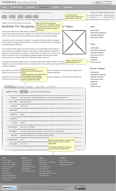
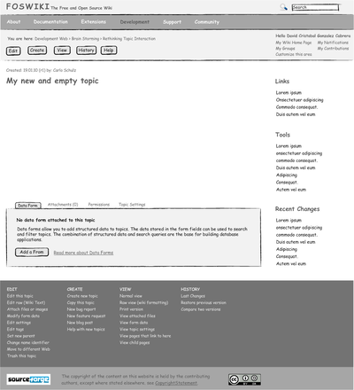
On RethinkingTopicInteraction and RethinkingTopicInteractionPrototype the UserExperienceTaskTeam discussed and defined a new concept for a more user friendly and workflow orientated way of interacting with topics. This topic documents the specific screen structure and states in more detail.Mock up / wireframe for view screen
Just sketches by now so we can avoid the discussion about colors, paddings and stuffSpecification of view screen components
Top bar
The top bar consists of the sections:- Logo and tagline,
- search box,
- (optional) horizontal navbar,
- breadcrumbs,
- topic interaction menu
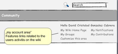
- "my account" area.
Logo
We need to make it easier for our users to change the logo and tag line. Therefore I'd like to introduce a temporary "change logo" link next the logo. Ideas for implementation:- Link is visible to the site admin only
- Link is removed after logo is changed for the first time (and after that the admin needs to go to web prefs)
Search Box
Again, we need to think about the old jump vs. search issue and decide what we want as default in the new skin.Horizontal Navigation
Meant to be optional. Open issues:- What is the default? Horizontal menu activated or deactivated?
- How do we make customization easier? Or is the way it is done in our current website skin sufficient?
- What are the initial nav items? Webs like in this mock up or something else?
Location Indicator / Breadcrumbs
Not much to say right now. Please add thoughts and ideas.Topic Interaction Menu
Menu bar for topic interactions. Currently, menu items are: edit, create, view, history and help. The menu bar, in conjunction with the „my account area“ works as a kind of control area and remains visible on most screen. Each button can be clicked (which triggers the default action). In addtion a mouse-over over each button opens a drop down menu. The drop downs interaction design should follow these guidelines: http://www.useit.com/alertbox/mega-dropdown-menus.html See RethinkingTopicInteraction for background information on the general concept. Wording definitions are managed on topic MenuItemsForTopicInteractionSide bar
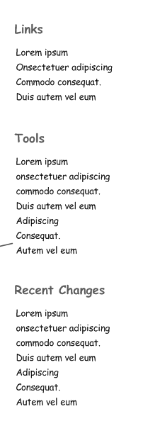
The actual default contents are not defined yet. Ideas:- sub navigation / list of webs
- Changes?
- ...
Content area
Contains the rev info, the h1 and the body text. We still need to agree on how to manage the whole page title vs. < h 1 > vs. name identifier issue.Action item: Find and link to regarding proposal topics. The rev info will be linked to the latest changes of the topic. See WireframesHistoryScreen
Meta Data Box
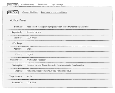
A tabbed box for meta data. Each tab section has specific edit actions. The idea is that the box is also there during edit with fields/contents editable. A „Comments“ section might be another candidate for the box.Form Data
There are three possible states.- form attached
- no form attached
Attachments
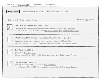
Attachment handling is largely improvable. Currently the rather user unfriendly manage screen is needed. The idea is to get rid of that screen by providing the possible actions in an unobtrusive way directly next to the attachment. For an attachment the following actions are defined: "update", "move", "delete", "rename", "display options". A possible implementation would be using the mouseover mechanism as one can see on http://pipes.yahoo.com/pipes/pipes.popular. For "edit description" we could use a pencil icon, perhaps on mouse over as well. Action item: Display (in edit) and handling of 'hidden' attachments.Permissions
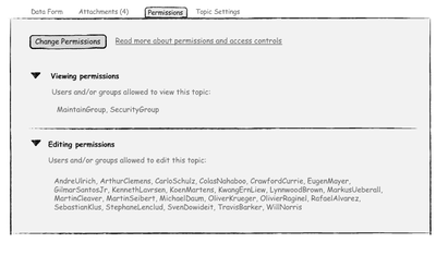
Definition of who's allowed to view or edit the current topic. Two states need to be adressed: permissions defined, permissions not defined.Topic Settings
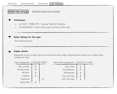
Note: this was labeled "View" respectively "Edit Settings" and handled across two tabs. I think this adds just another tab without adding that much value. So I joined them on one tab called "Topic Settings". Topic Settings contains the topics prefs plus definition of what is displayed and what's not (breadcrumbs, meta data box [or just specific tabs], sidebar, header, etc.).Footer / bottom bar
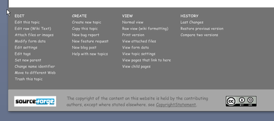
The bottom bar features the contents of the topic interaction menus. Handy on large topics. An alternative approach would be using this area for navigation links. The copyright note: I thing this can be left as is.Discussion
I needed a bit more structure to better assess what I've mocked up already and what is still missing. Most remarks are integrated in above documentation or have been moved to DesignStudiesForNewSkin.. -- CarloSchulz - 10 Jan 2010 Don't forget the "change form" state. -- MichaelDaum - 11 Jan 2010 Btw found this write up: The case against vertical navigation.- Interesting that this article is on a website which is designed exactly the way I hate websites. I love my left bar, and looking at how it is used and tailored in practical use, it actually works well in a wiki context. It is wrong to just dismiss it like this. The horizontal navigation bar suggested in these wireframes is nice and the right way to go. But that should not prevent ALSO having a left bar that can be added per web basis and be used actively. And for sites with many webs it is a hard to live without. It is a pain having to use a pulldown to navigate from web to web. For single purpose wikis you do not have the same need for a side bar. -- KennethLavrsen - 22 Jan 2010
UserExperienceProjectForm edit
| TopicTitle | Wireframes view screen |
| TopicSummary | Wireframes for view screen of new release skin |
| Subject | skin |
| Status | abandoned |
| Status note | no activity |
| Driver | |
| Skills needed | analysis |
| InterestedParties | PaulHarvey |
Edit | Attach | Print version | History: r56 < r55 < r54 < r53 | Backlinks | View wiki text | Edit wiki text | More topic actions
Topic revision: r56 - 12 Mar 2014, MichaelDaum
The copyright of the content on this website is held by the contributing authors, except where stated elsewhere. See Copyright Statement.  Legal Imprint Privacy Policy
 Legal Imprint Privacy Policy
